You have a multitude of applicants to review...so...
so
...
let's cut to the
Chase
Let's cut to the
Chase

Chase Murphy
Senior UX Designer


Chase Murphy
Senior UX Designer
Senior UX Designer
Senior UX Designer
Bob's Discount Furniture
Mobile Redesign
Timeline
12 weeks (design)
8 weeks (dev)


Results
12% increase in add to cart
23% increase in engagement
6% decrease in bounce rate
Controlled testing still underway


Tools
Figma
Webflow
AB Tasty
Quantum Metric
Illustrator


Team
1 Senior UX Designer (me)
1 Director of eCommerce
1 Product Manager
2 Front End Developers


Bob’s Discount Furniture recently underwent a website redesign. However, the mobile user experience was not prioritized during the site refresh. Since then, they have been unable to make significant UX improvements to the website, including the product details page due to an insufficient code base and an understaffed UX department.
For Bob’s Discount Furniture, mobile is the largest source of traffic--with more than 80% of users visiting the website on their mobile devices. In addition, a large portion of these users either view, or land directly on a product details page (PDP).
Bob’s Discount Furniture recently underwent a website redesign. However, the mobile user experience was not prioritized during the site refresh. Since then, they have been unable to make significant UX improvements to the website, including the product details page, due to an insufficient code base and an understaffed UX department.
For Bob’s Discount Furniture, mobile is the largest source of traffic--with more than 80% of users visiting the website on their mobile devices. In addition, a large portion of these users either view, or land directly on a product details page (PDP).
I began this project like I do most projects--I hosted multiple meetings with stakeholders to align on business goals, delved into our analytics tools to gather user data and behavior patterns, and conducted extensive competitive analysis reports. From there it was my responsibility to create a design that struck that right balance between business goals and user goals.
The metrics I was responsible for delivering positive upward lift on were the add-to-cart rate and overall engagement rate with other elements on the page. In addition, I was responsible for decreasing the bounce rate. Additional metrics we were keeping an eye on were average order value (AOV), financing engagement, and view similar products.
Bob’s Discount Furniture recently underwent a website redesign. However, the mobile user experience was not prioritized during the site refresh. Since then, they have been unable to make significant UX improvements to the website, including the product details page, due to an insufficient code base and an understaffed UX department.
For Bob’s Discount Furniture, mobile is the largest source of traffic--with more than 80% of users visiting the website on their mobile devices. In addition, a large portion of these users either view, or land directly on a product details page (PDP).

Despite having most of the high-level information available to the user, the design makes it difficult to consume. Furthermore, product images are viewed more than 100% by our users--but the image gallery is not visible above the fold on page load.

Here we have a beautiful marriage between antiquated UI and poor UX. This is the first time the user has the option to add the product to their cart, Goof Proof protection is competing with ATC, and there is no mention of Bob's financing options...just to name few issues.

Delivery, pick up, and see in person are important to both the business and the customer. However, the user also cares about product description, details, dimensions, etc. A problem arises with an overcomplicated information architecture.
Despite having most of the high-level information available to the user, the design makes it difficult to consume. Furthermore, the product images are no where to be found within view-port on page load.
Here, we have a beautiful marriage between antiquated UI and poor UX. This is first time the user has the option to add the product to their cart, Goof Proof protection is competing with ATC, and there is no mention of Bob's financing options...just to name few issues.
Delivery, pick up, and see in person are important to both the business and the customer. However, the user also cares about product description, details, dimensions, etc. Perhaps these could be combined into a single visual family...
Bob’s Discount Furniture recently underwent a website redesign. However, the mobile user experience was not prioritized during the site refresh. Since then, they have been unable able to make significant UX improvements to the website, including the product details page, due to an insufficient code base and an understaffed UX department.
For Bob’s Discount Furniture, mobile is the largest source of traffic--with more than 80% of users visiting the website on their mobile devices. In addition, a large portion of these users either view, or land directly on a product details page (PDP).
By utilizing quantitative data from Quantum Metric, test results from AB Tasty, and other user behavior information, the wireframe process began.

By utilizing quantitative data from Quantum Metric, test results from AB Tasty, and other user behavior information, the wireframe process began.

For the top of the PDP, this information hierarchy quickly shows the stock status, product title, and reviews. It also allows the product images to peak above the fold.
The sticky element which contains price, financing, and the add to cart button, animates in from the bottom of view port 1.5 seconds after page load.

Aside from the price, the product look/feel and dimensions are the most important data points a user takes into consideration when buying our furniture. To solve for this, I introduced a four button grid to allow the user to quickly access this information.

The four button grid--as well as numerous other buttons and links throughout this page--leverage a toast drawer upon interaction. This design feature provides the user the opportunity to delve into a subject, learn more, and seamlessly return to where they they began without losing their place on the page.

Promoting financing (and more specifically, Bob's financing options) was an important business goal. This was a fun challenge to solve, as I had to find a way to group all financing options together, while simultaneously draw more attention to the Bob's financing option.
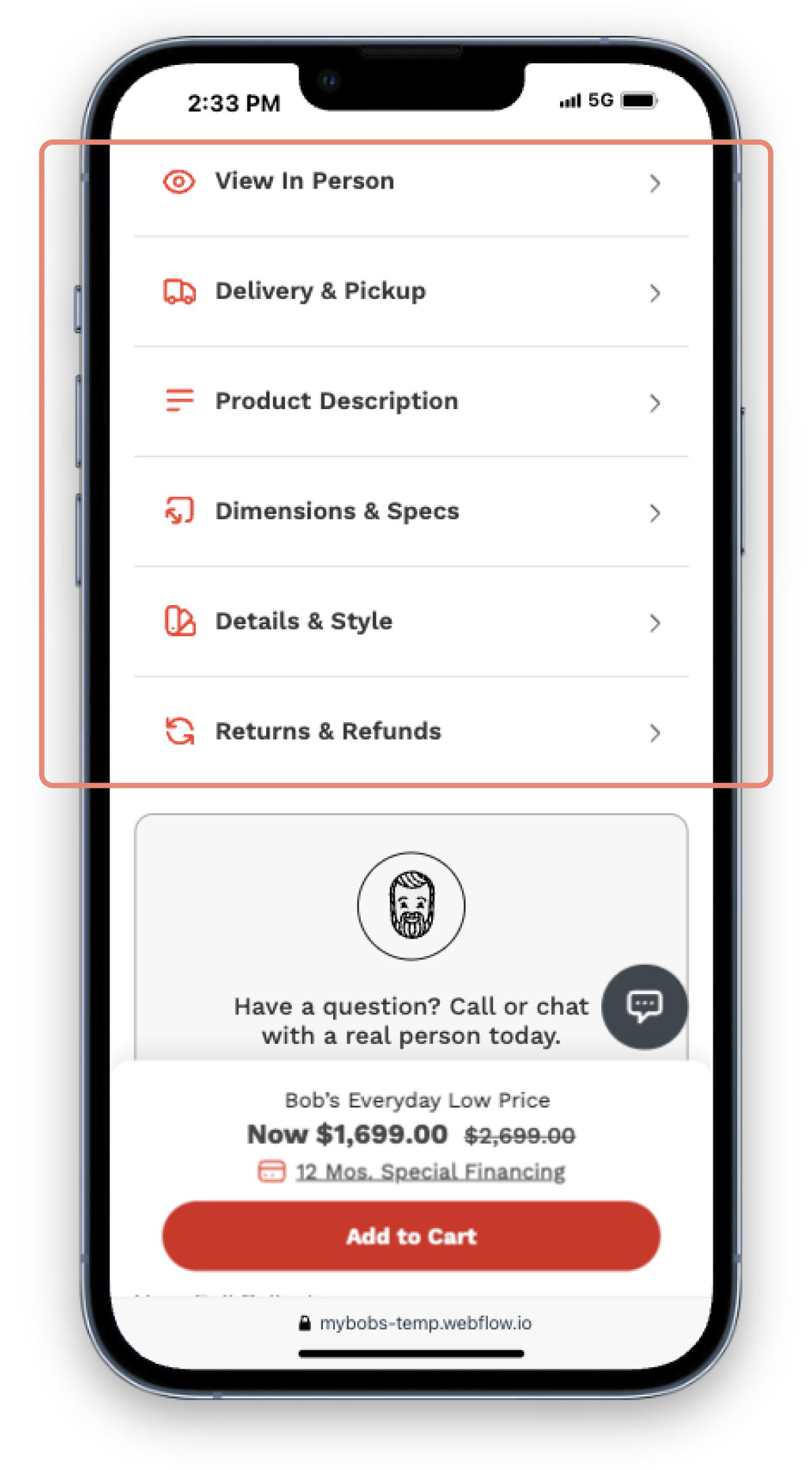
Most of this information almost equally important to our users; or at least, equally specific. This dropdown family provides a succinct place for the user to learn the 2nd information about the product. Per a business request, we have elected to have Delivery & Pickup default as open on page load.

Through our quantitive research, we learned that the more times a customer interacts with any product, there is a direct positive correlation with the add to cart rate. Therefore, a touch up this experience was also relevant. A horizontal scroll, showcasing large images, price, and reviews, was the solve.
For the top of the PDP, this information hierarchy quickly shows the stock status, product title, and reviews. It also allows the product images to peak above the fold.
The sticky element which contains price, financing, and the add-to-cart button, animates in from the bottom of view port 1.5 seconds after page load.
Aside from the price, the product aesthetic and dimensions are the most important data points a user takes into consideration when buying our furniture. To solve for this, I introduced a four button grid to allow the user to quickly access this information.
The four button grid--as well as numerous other buttons and links throughout this page--animate a toast drawer upon tap. This design feature provides the user the opportunity to delve into a subject, learn more, and seamlessly return to where they they began without losing their place on the page.
Promoting financing (and more specifically, Bob's financing options) was an important business goal. This was a fun challenge to solve, as I had to find a way to group all financing options together, while simultaneously drawing more attention to the Bob's financing option.
Most of this information is almost equally important to our users, or at least equally relevant. This dropdown family provides a succinct place for the user to learn second tier information about the product. Per a business request, we have elected to have Delivery & Pickup default as open on page load.
Through our quantitive research, we learned that the more times a customer interacts with any product, there is a direct positive correlation with the add-to-cart rate. Therefore, a touch up of this experience was also prudent. A horizontal scroll, showcasing large images, price, and reviews, was the solve.
Product
Image gallery viewed more than 100% on average
Image gallery viewed more than 100% on average
Modern design
Product dimensions important to user
Financing
Image gallery viewed more than 100% on average
Image gallery viewed more than 100% on average
Image gallery viewed more than 100% on average
Image gallery viewed more than 100% on average
Accessibility
Image gallery viewed more than 100% on average
Image gallery viewed more than 100% on average
Image gallery viewed more than 100% on average
Image gallery viewed more than 100% on average
Business
Image gallery viewed more than 100% on average
Image gallery viewed more than 100% on average
Image gallery viewed more than 100% on average
Image gallery viewed more than 100% on average
